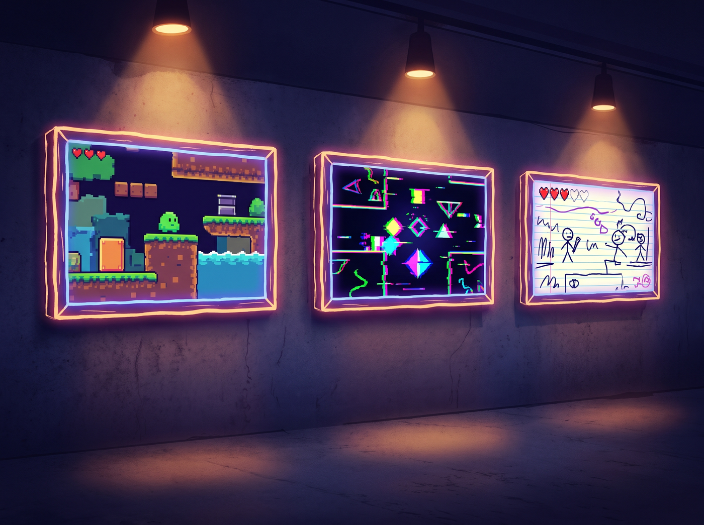
Why these games matter
Every game on this list was made with limited art resources — either a solo developer, a tiny team, or a deliberate decision to use simple visuals. What they have in common is that they didn't apologize for their art style. They owned it, used it as a strength, and in many cases the visual style became part of the game's appeal.
Use this showcase as inspiration. If your game looks like programmer art right now, you're in good company.
The classics
Minecraft
3D voxel Sandbox Best-selling of all time
What started as a one-person project with intentionally blocky graphics became the best-selling video game of all time. Minecraft's visual style — simple voxel-based cubes, default textures, no pre-rendered graphics — was a practical choice for a solo developer working in Java. It became the game's most recognizable feature and spawned an entire genre of voxel-based games.
The takeaway: simple art that's consistent and serves the gameplay can become more iconic than the most detailed rendered visuals.
Dwarf Fortress
ASCII Roguelike sim 20+ years in development
Two brothers have been developing Dwarf Fortress since 2002, using ASCII characters as graphics for most of that time. The game's famously complex simulation runs entirely on text symbols, and its dedicated fan base prefers it that way. When the game finally got a graphical release on Steam in 2022, it sold half a million copies in its first month — with the ASCII version still available.
The takeaway: if your gameplay is deep and unique enough, players will accept literally any presentation.
RimWorld
Top-down 2D Colony sim Solo developer
Ludeon Studios' colony sim was primarily developed by one person, Tynan Sylvester. The game's distinctive visual style — top-down view, simple character sprites, abstracted architecture — wasn't a deliberate artistic statement so much as a practical choice for a small team. It became instantly recognizable and has been imitated by dozens of other indie colony sims.
The takeaway: a consistent, readable art style can define a genre, not just a game.
Minimalist 3D
Thomas Was Alone
2D platformer Geometric Narrative focus
A game about rectangles with different properties and personalities. That's literally all the visuals are — colored rectangles on a dark background. The game's charm comes entirely from its writing, narration, and level design. Yet it won BAFTA awards and sold over a million copies.
The takeaway: the simplest possible art can work if every other part of the game is excellent.
Superhot
3D FPS Time manipulation Minimalist
Red enemies, black environments, white weapons — that's the entire color palette. Superhot's art style was born from a game jam constraint and became the game's signature look. The stark red-on-white visuals are instantly recognizable and became a key part of the game's marketing.
The takeaway: extreme visual constraint can create a stronger identity than unlimited artistic freedom.
VVVVVV
2D platformer Retro pixel Solo developer
Terry Cavanagh's gravity-flipping platformer has a deliberately retro style inspired by 1980s 8-bit games. The simple visuals let the tight level design and distinctive mechanics take center stage. The game is regarded as a classic of the indie platformer genre.
The takeaway: a specific, well-chosen reference point (even an old one) gives simple art credibility.
Modern examples
Minit
Top-down 2D Adventure 60-second timer
A top-down adventure game where you die every 60 seconds and keep your items. The pixel art is simple and chunky, with a limited color palette. It works because the gameplay loop is the star, and the art is clean and readable enough to not get in the way.
The takeaway: good art supports the game's core idea without competing with it.
Slay the Spire
Card roguelike 2D Mega Crit
While not strictly "programmer art" (the team did have an artist), Slay the Spire's visual style is notable for being functional rather than flashy. The card art is serviceable, the enemies are simple, and the focus is entirely on the systems. The game defined a genre and sold millions of copies without chasing AAA visual quality.
The takeaway: for systems-driven games, functional art that doesn't distract from the mechanics is the right choice.
You Have to Burn the Rope
2D platformer Satire Short form
A famously short game that satirizes both game design and the idea of programmer art. The game deliberately has minimal presentation — stick figure protagonist, simple geometry, basic colors — to make a point about how most of what we think of as "important" in game development is actually just polish.
The takeaway: sometimes minimal art isn't a limitation — it's a punchline.
Common patterns
All these different games share a few things in common:
- Consistency. Whatever the art style, it's applied consistently throughout the game. There's no mix of detailed and rough assets.
- Readability. Players can instantly tell what everything is and what it does. Clarity beats detail.
- Strong gameplay. In every case, the core game loop is good enough to carry the experience. Simple art doesn't save bad gameplay.
- Distinctiveness. The games all look unique and recognizable. You'd never mistake any of them for something else.
- Ownership. None of these games apologize for their art style. They present it confidently as a deliberate choice.
Browse the indie sections of Steam or itch.io. Many of the most interesting and innovative games have simple art — because they're made by small teams who spend their time on systems and design instead of assets.