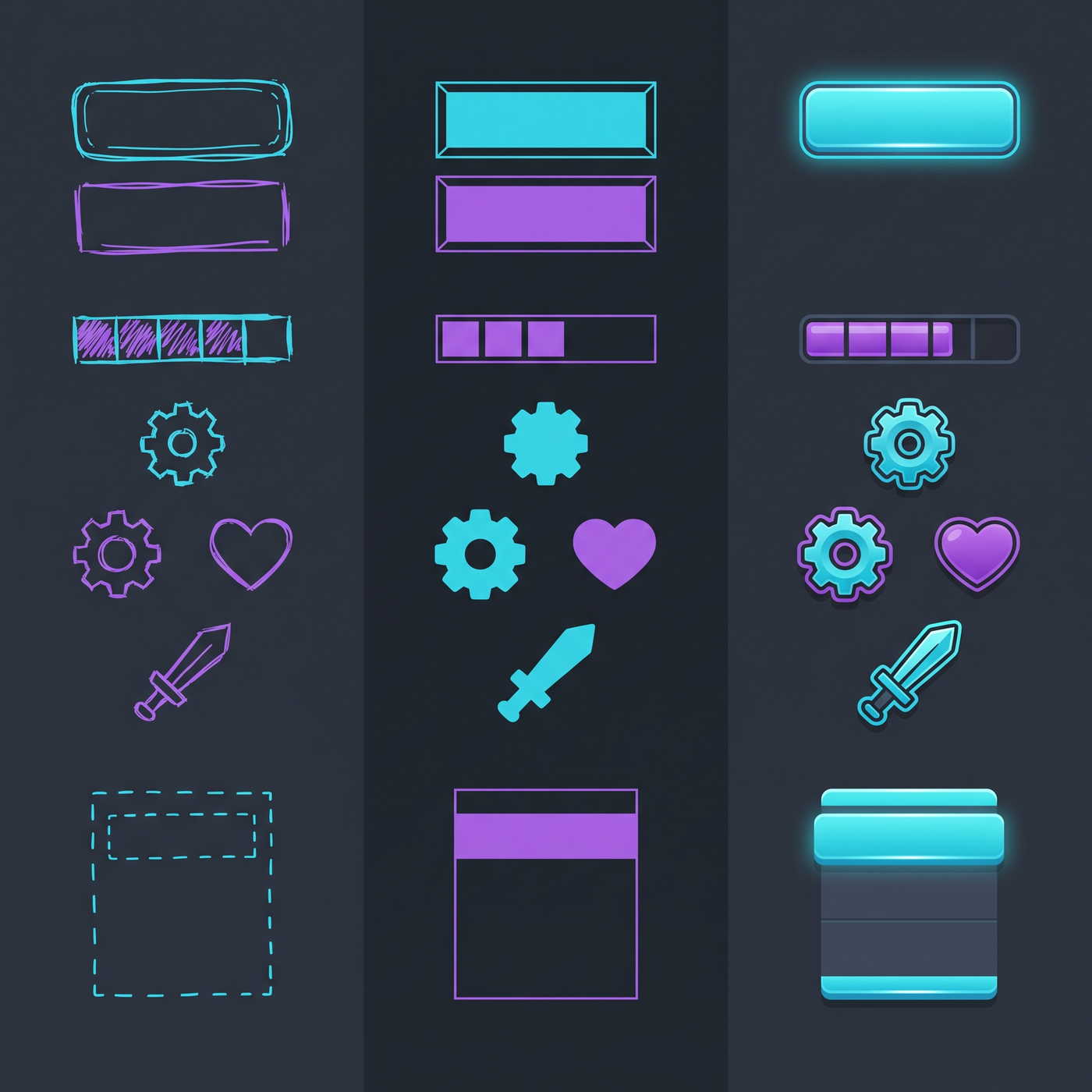
UI is a layout problem
Most programmers struggle with UI design because they think it's about making things look pretty. It's not — at least not primarily. Good UI is about clarity, hierarchy, and information architecture. These are problems you already know how to solve.
Think of your UI like you think of code: structure first, details last. Establish a clear hierarchy, consistent spacing, and readable typography. The visual polish comes after, and it matters much less than you think.
Core principles
1. Hierarchy over decoration
The most important job of any UI is to tell the player what's important and what they should do next. If everything is emphasized equally, nothing stands out. Use size, color, weight, and position to create a clear visual hierarchy.
Ask yourself: what does the player need to see first? Second? What can they ignore until they need it? Design the interface so the answer is obvious without thinking.
2. Consistency is everything
A consistent UI with mediocre aesthetics will always look better than an inconsistent UI with great aesthetics. If your buttons are different sizes, your spacing is random, and your colors change from screen to screen, the interface will feel broken no matter how well-drawn each individual element is.
Define a system and stick to it: one button style, one set of spacing values, one font family (2-3 weights max), a defined color palette. Apply them everywhere.
3. White space is your friend
The most common UI mistake programmers make is packing everything too close together. Good design breathes. Use generous spacing to separate elements, group related things together, and give important elements room to be important.
A good rule: if you're unsure whether two elements need more space between them, they probably do.
4. Typography carries most of the weight
Most UI is text. If your text is readable, well-sized, and properly spaced, your UI will already look 80% professional. You don't need fancy fonts — a single good sans-serif font used consistently is better than a dozen decorative fonts used inconsistently.
- Use a clear sans-serif font for body text
- Stick to 2-3 sizes and 2 weights (regular and bold)
- Make sure the smallest text is still readable at your target resolution
- Use line height (leading) generously — 1.5x the font size is a good starting point
- Don't center long paragraphs — left-aligned text is easier to read
Use a spacing scale — e.g., 4px, 8px, 16px, 24px, 32px, 48px — and only use those values for padding and margins. This is the single fastest way to make a UI feel intentional and designed.
Color for UI
UI color palettes should be much more restrained than art palettes. Most of your interface should be neutral, with color used sparingly for important elements.
A practical UI palette
- Background color — dark or light, your choice. Pick one and stick with it.
- Surface color — a lighter or darker shade of the background, for panels and cards.
- Primary accent — your main brand color, used for primary actions and highlights.
- Secondary accent — a second color, used sparingly for secondary actions or variety.
- Text colors — 2-3 shades: primary (most text), secondary (less important text), muted (labels, metadata).
- Status colors — success (green), warning (yellow/orange), error (red). Keep these muted — neon colors are hard to look at for long.
Button design
Buttons are the workhorse of any UI. Making them look good is mostly about consistent padding, clear states, and readable text.
- Primary button. Filled with your accent color, white text. The most prominent action on the screen.
- Secondary button. Outline or ghost style, accent color text. For less important actions.
- Disabled state. Muted colors, lower opacity. Make it obvious but not jarring.
- Hover state. Slight brightness change or scale. Give the player feedback that they're hovering.
- Pressed state. Slightly darker or pressed in. Confirmation that the click registered.
The exact visual style matters less than the consistency and clarity of the states. Players should instantly know what's clickable, what's active, and what's disabled.
Sprite design for UI
Sometimes you need actual art assets for your UI — icons, health bars, inventory slots, or decoration. Keep these principles in mind:
- Readability first. Can you tell what the icon is at a glance, at small size? If not, simplify it.
- Consistent style. All UI art should come from the same visual family — same stroke width, same level of detail, same color palette.
- Use icon fonts where possible. Libraries like Font Awesome and Material Icons provide hundreds of clean, consistent icons for free. You can color and scale them like text.
- Keep decoration minimal. UI art should support the information, not compete with it. If a decorative element isn't adding clarity, remove it.
Health bars and HUD elements
Game-specific UI elements like health bars, ammo counters, and minimaps have to be functional above all else. They also contribute a lot to the game's visual identity.
Best practices for HUD design:
- Put important things in corners. Top-left and bottom-right are traditional for health and resources. Center is for crosshairs and targeting.
- Keep it small. HUD elements should be visible but not distracting. The game world is the main event.
- Use color for status. Health goes from green to yellow to red — players instantly understand this.
- Add animation for feedback. A health bar that smoothly decreases and flashes on damage feels better than one that instantly jumps. Use sparingly.
- Consider transparency. Semi-transparent HUD panels let the game show through and feel less intrusive.
Common mistakes
- Too many colors. If every element is a different color, nothing stands out. Stick to your palette.
- Inconsistent spacing. Random gaps between elements make the UI feel unprofessional. Use a spacing system.
- Centered everything. Center is for titles and buttons, not for paragraphs of text or lists of options.
- Tiny text. If the player has to squint to read it, it's too small. Test on your target platform.
- Bevel and gloss effects. Unless you're specifically going for a 2000s retro UI look, avoid bevels, drop shadows everywhere, and glossy buttons. Flat and clean ages better.
- Too many font sizes. If you have more than 3-4 distinct text sizes, you probably need to consolidate.
UI testing checklist
Before you ship a screen, run it through this checklist:
-
1
Is the most important thing the most visible?
Squint at the screen. What stands out first? Is it what the player needs to see first?
-
2
Can you read all the text?
Test at your target resolution from a normal viewing distance. If you have to lean in, it's too small.
-
3
Are clickable things obviously clickable?
Buttons should look like buttons. If players have to guess what's interactive, the design failed.
-
4
Is everything aligned?
Edges should line up. Things in the same group should start at the same x position. Use alignment guides or layout groups.
-
5
Is it consistent with the rest of the game?
This screen should look like it belongs with the other screens in your game.